
Do your photos look good individually, but feel like they belong to different accounts when you open your profile? A cohesive Instagram feed starts with a few repeatable choices, not the same filter on every photo.
Start with two or three reference colors, a similar brightness range, and clear roles for photos and text cards. Choose one of the everyday, product, or educational layouts below, then apply it to your next three posts. These numbers are starting points, not official Instagram rules.
First, which “feed” are you designing?
This guide is about the collection of posts on your profile, also called the profile grid. It is not a way to control the order of posts in someone else's Home feed.
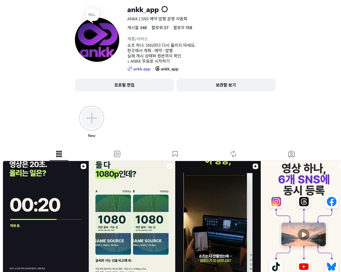
Actual screenshot: @ankk_app's public profile, captured in desktop Chrome on September 10, 2026. The original interface and account content are in Korean. This view displayed four columns. It shows where the profile introduction and thumbnails appear together; it is not evidence of performance or a model of ideal design.
The 3×3 boards below are fictional layout examples for comparing colors and content choices. They are not a fixed Instagram display specification or an upload-order chart. The visible columns and area can vary with screen width and viewing environment, so check your own profile on your phone before publishing.
1. Decide what to repeat before choosing a color scheme
Before looking for more attractive photos, describe your account in one sentence: “quiet everyday moments,” “information that helps people choose a product,” or “short practical tips for beginners.” A clear theme makes it easier to decide which photos belong.
Write down three choices:
| Choice | A starting example | What to avoid |
|---|---|---|
| Reference colors | Ivory background, sage accent, dark text | Changing every background and accent color between posts |
| Brightness and mood | Soft daylight; subjects remain visible in darker images | The same product appearing to be different colors |
| Cover style | Short titles with consistent spacing and placement | Changing typeface, text size, and position every time |
Consistency does not mean recoloring every object. Choose colors to repeat in backgrounds, props, and title cards. Adobe also describes an approach that starts with an overall mood and then adjusts photo color and brightness. Adobe's feed image guide, in Korean
For a product account, accurate product color comes first. Avoid edits that make a white pouch look beige or remove the visible texture of its fabric.
2. What changes when the images feel more consistent?
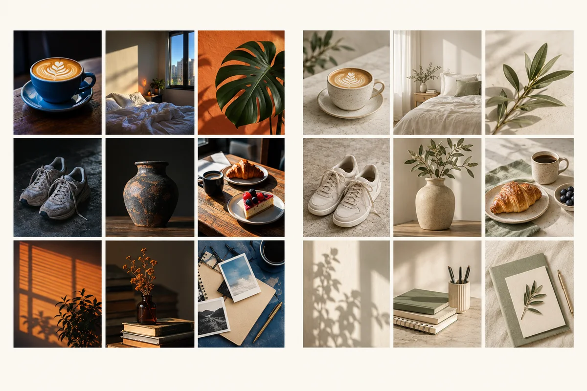
Left: mixed color temperatures, saturation, and brightness. Right: a coordinated mood. Both boards are AI-generated illustrations. They are not real before-and-after edits of the same source photos or evidence of an account's improvement.
Alongside “Do I like this photo?”, ask:
- Brightness: Does one image look unusually dark or washed out beside the others?
- Background: Are all the scenes busy? Could you include a simpler background?
- Distance: Is every shot a similar close-up? Can you mix wider scenes and details?
- Text cards: Is a cover title too small or too long to read as a thumbnail?
Choose one reference photo, then compare the others against its brightness and color temperature. Applying identical adjustments does not produce identical results when the original lighting differs. Check each photo after editing.
3. Everyday layout: nine photos connected by mood
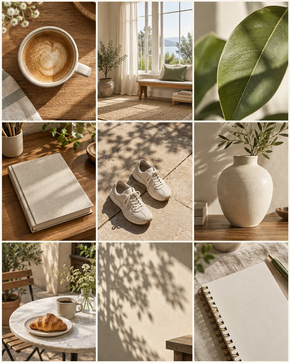
An AI-generated everyday photography board, not a real personal account or photographic diary.
An everyday account does not need to photograph the same place or object repeatedly. Here, coffee, interiors, and plants share warm light and a palette of wood, ivory, and green.
| Board row | Left | Center | Right |
|---|---|---|---|
| Top | Coffee close-up | Wide window scene | Leaf texture |
| Middle | Book and desk | Shoes suggesting a walk | Vase and foliage |
| Bottom | Café table | Shadows on a wall | Notebook and pen |
The useful contrast is camera distance and how busy the background feels. Mix frame-filling subjects, such as coffee and leaves, with quieter scenes that have more breathing room.
For your next three posts, list subjects first: “today's space → a small object → light or texture.” Choose a system you can keep using, rather than trying to maintain perfect rows.
4. Product layout: six photos and three information cards
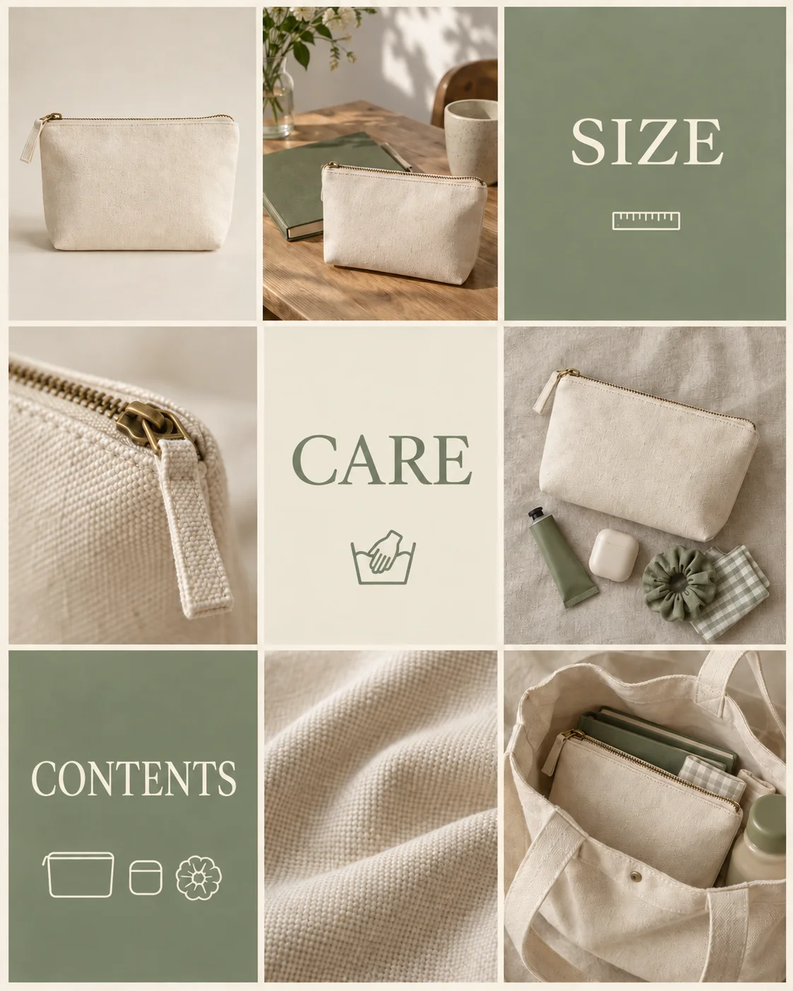
An AI-generated fictional product and layout. SIZE, CARE, and CONTENTS are suggested content topics, not specifications or care instructions for a real product.
Repeating attractive product photos can leave visitors' questions unanswered. Give photos and practical information separate jobs.
| Board row | Left | Center | Right |
|---|---|---|---|
| Top | Full product view | Product in context | Size card |
| Middle | Zipper detail | Care card | Product with everyday items |
| Bottom | Contents card | Fabric detail | Product inside a tote bag |
Photos show shape, use, and texture. Cards organize questions a visitor might ask. The 6:3 split is one option, not an ideal ratio for every account.
Use measured dimensions, verified package contents, and the manufacturer's care instructions in real posts. Do not invent features or included accessories to suit the look of an image. If you use a customer review, verify that it is genuine and that you have permission to use it.
Your next three posts could be “the whole product → a real use case → one common question.” Pick a photo, then use an information card to answer something the photo alone cannot explain.
5. Educational layout: three photos and six title cards
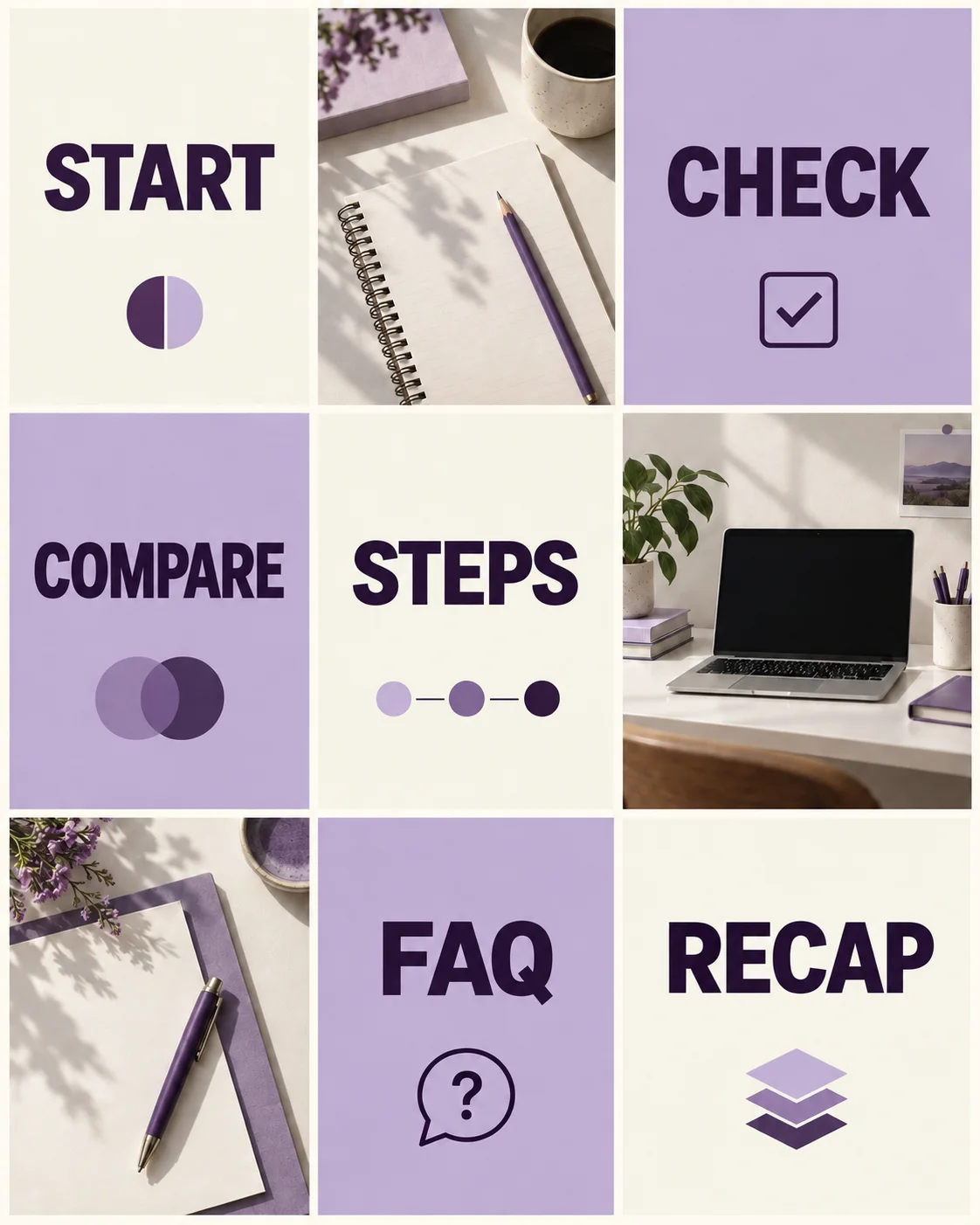
An AI-generated fictional educational board, not a published carousel or an ANKK product screen.
For an educational account, the cover should tell people what they can learn. Keep it short and put the detail in later carousel slides or the caption.
| Board row | Left | Center | Right |
|---|---|---|---|
| Top | Getting started | Notebook photo | Checklist |
| Middle | Comparison | Step-by-step process | Workspace photo |
| Bottom | Materials photo | Common questions | Key takeaways |
The short labels show each card's role. In real posts, add the topic: “Before you film,” “Two fabrics compared,” or “Packing steps.” Adjust the title length while checking how it reads at thumbnail size.
Repeat typefaces, title placement, and background colors without making every card identical. A comparison can show two options; a process card can show a sequence. For help with the accompanying text, see our Instagram caption guide and examples.
6. Separate the layout from the upload order
A nine-post board is a planning aid, not an instruction to upload from the top-left cell onward. New posts and pinned posts can change the visible arrangement.
Instagram has introduced profile pinning, and in 2025 announced plans to let people reorder grid posts. An announcement alone does not establish that every account has the same editing controls. We have not directly tested mobile grid reordering for this guide. Meta's pinning announcement, in Japanese, Meta's grid-reordering announcement
Check the options actually shown in your account. Do not delete and repost existing content just because a particular menu is missing. Photos and covers that work in more than one position are easier to keep using as the account changes.
Be cautious with puzzle layouts that split one large image into nine posts. They may connect on the profile, but someone seeing a single post in their Home feed may see only a fragment. Check that each individual post still makes sense on its own.
The uploaded image and profile preview may look different
A title that is visible in the full post can be cropped in the profile thumbnail. Keep important faces, products, and titles away from the edges, then check both views. If you publish Reels too, apply the same check to the cover shown on your profile.
For the upload steps, see posting on Instagram: multiple photos, sizes, and desktop uploads.
7. A checklist for your next three posts
Instead of redesigning your whole account, prepare the photos, covers, and captions for your next three posts together.
- I can describe the account's recurring theme in one sentence.
- Background and text colors follow a repeatable system.
- Brightness adjustments preserve real product colors and textures.
- I have compared camera distance and backgrounds, not only similar close-ups.
- Cover titles remain readable when small and explain the topic.
- Each post makes sense on its own.
- I check both the post and the profile preview on my phone.
- I check the publishing account, caption, date, and time together.
Information that needs to stay easy to find, such as product introductions or buying instructions, can have a separate role in your Instagram Highlights.
Frequently asked questions
Will a better-looking feed increase followers or views?
These examples are design suggestions for colors and information layout, not experiments proving increases in followers, views, or sales. When reviewing your own results, do not assume design changes alone caused them.
Do I need the same filter on every photo?
No. Different lighting and original colors produce different results even with the same filter. Compare each image with a reference photo, and keep actual product colors accurate.
Do I have to publish all nine posts at once?
No. Nine cells help you compare several posts together. Prepare your next three, then publish according to each post's purpose and schedule.
Should I delete all my old posts and start over?
There is no need to do that. Start by applying your choices to new photos and covers. Decide separately whether older posts need attention, based on their accuracy, what you want to preserve, and the options available in your account.
Once the design is ready, plan the publishing
After choosing the visual direction and content, decide where and when each post should go. ANKK is a social media management product for planning, scheduling, and publishing prepared content to multiple social networks from one place, without setting up each post separately on every platform.
It is not a feed-design or photo-editing tool. Use it to manage channel-specific copy and schedules, then check the actual publishing status and original social posts.
Explore ANKK's planning, scheduling, and publishing workflow
Reference date: September 10, 2026. The actual screenshot shows ANKK's public Instagram account on desktop, in Korean. The hero, comparison, and nine-post boards are AI-generated illustrations, not official Instagram or Meta templates.